The Face Room
Advanced skin aesthetics and facial treatment studio with a clean service menu and booking flow.
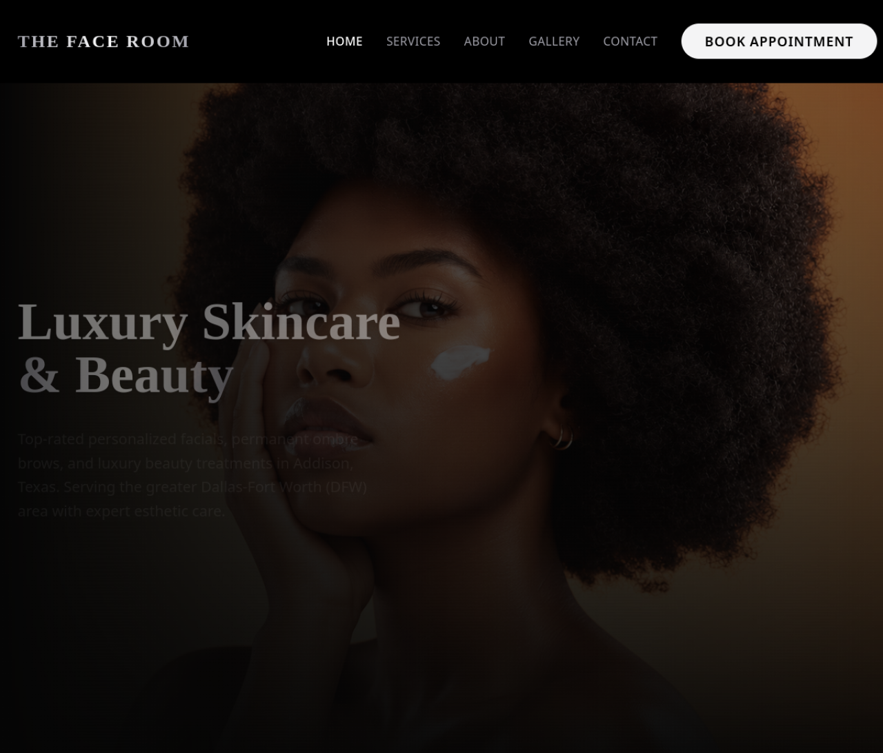
Goals & Decisions
The real outcomes this build was designed around, and the concrete decisions that shaped it.
- Balance clinical credibility with an inviting, premium atmosphere
- Educate clients enough to feel confident booking an advanced treatment
- Make the next booking step impossible to miss
- Calm, clinical palette: A restrained, calming color and type system signals clinical trust without feeling sterile or cold.
- Education before the sale: Skin-health content was surfaced as part of the journey so clients understand the 'why' of a treatment before the price.
- Booking-first flow: The booking path was made the dominant action throughout the site so the next step is always one tap away.
- A refined digital presence that positions The Face Room as a premium skincare destination
- An experience designed to move browsers from research to booking with minimal friction
Present an advanced aesthetics studio as both clinical and inviting while making the next booking step obvious.
Built a clean, calming service-menu layout with skin-health education content and a frictionless booking path.
A refined digital presence that positions The Face Room as a premium skincare destination.
Skincare / Aesthetics demands a visual language that signals trust and quality before a visitor reads a single word. The direction here leans on clear hierarchy, intentional negative space, and a mobile-first layout that loads fast and guides the eye toward the next action.
- Strong typographic hierarchy and scannable sections
- Premium, on-brand color and imagery treatment
- Conversion-focused call-to-action placement
Most customers first encounter the business on a phone, so the build is designed mobile-first rather than shrinking a desktop layout down. Navigation, content order, tap targets, and load speed are all tuned for the small screen.
- Thumb-friendly tap targets and single-column flow
- Fast, lightweight pages optimized for mobile networks
- Frictionless path to contact, booking, or quote
What was built
Built for every screen
The desktop build and the mobile build share one design system — each tuned for the screen where customers actually use it.