Pro-Line Sport & Spine
Healthcare & physical therapy authority portal trusted by high-profile sports professionals and athletes.
Goals & Decisions
The real outcomes this build was designed around, and the concrete decisions that shaped it.
- Establish Dr. Browning's clinical authority within the first 5 seconds
- Give elite athletes a reason to trust a Frisco clinic over national brands
- Make the path from 'researching an injury' to 'booking an evaluation' frictionless
- Authority-first hierarchy: Credentials, specialty, and high-profile endorsements were placed above the fold so trust is earned before any service detail is shown.
- Technology as proof: The VALD strength-testing breakdown was surfaced as a feature, not buried · it signals clinical sophistication that competitors don't offer.
- Portal-first conversion: PTEverywhere integration was wired as the primary CTA so existing patients have a single obvious next step.
- A clinical lead engine designed to attract elite high school, collegiate, and active-adult patients
- A patient journey that moves from research to evaluation booking without a phone call bottleneck
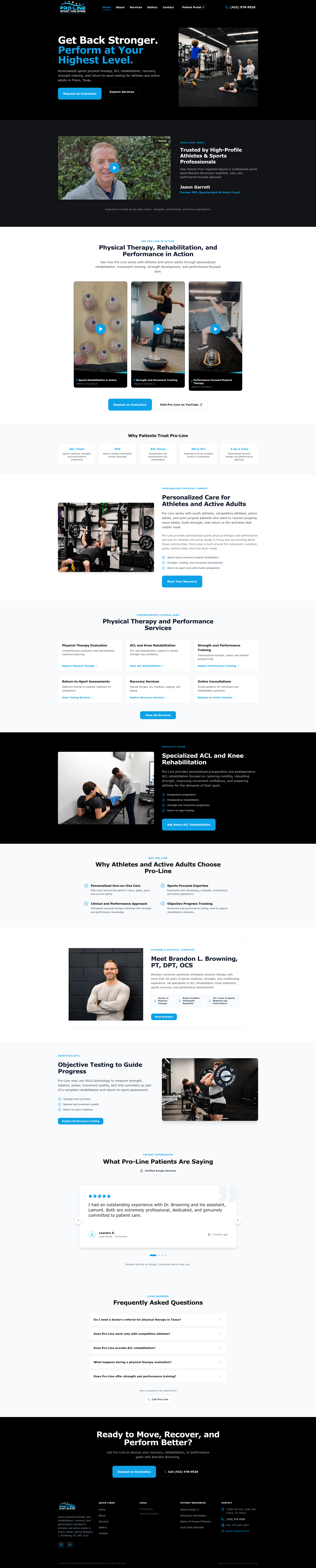
Establish immediate clinical authority for Dr. Brandon Browning PT, DPT, OCS in Frisco TX while simplifying patient intake.
Designed an authority-first healthcare layout featuring NFL coach Jason Garrett endorsement videos, VALD strength tech breakdowns, and PTEverywhere portal integration.
A clinical lead engine attracting elite high school, collegiate, and active adult patients.
Sports Physical Therapy / Performance demands a visual language that signals trust and quality before a visitor reads a single word. The direction here leans on clear hierarchy, intentional negative space, and a mobile-first layout that loads fast and guides the eye toward the next action.
- Strong typographic hierarchy and scannable sections
- Premium, on-brand color and imagery treatment
- Conversion-focused call-to-action placement
Most customers first encounter the business on a phone, so the build is designed mobile-first rather than shrinking a desktop layout down. Navigation, content order, tap targets, and load speed are all tuned for the small screen.
- Thumb-friendly tap targets and single-column flow
- Fast, lightweight pages optimized for mobile networks
- Frictionless path to contact, booking, or quote
What was built
Built for every screen
The desktop build and the mobile build share one design system — each tuned for the screen where customers actually use it.