Alexandro Design Group
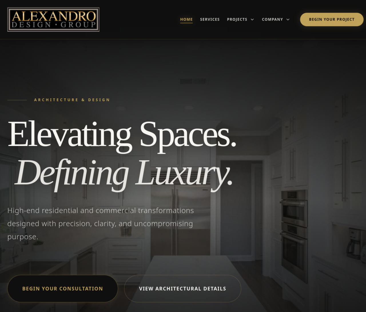
Architectural design group portfolio with an editorial layout built around visual identity and creative storytelling.
Goals & Decisions
The real outcomes this build was designed around, and the concrete decisions that shaped it.
- Translate the studio's offline design sensibility into a digital portfolio that feels like an extension of their brand
- Let architecture photography lead the hierarchy instead of competing with it
- Make the work scannable in under 10 seconds
- Image-first over copy-first: Photography was given the majority of above-the-fold real estate so a visitor judges the studio's craft visually before reading a word.
- Restrained motion: Subtle scroll reveals and gentle transitions were used instead of heavy animation so the work · not the effects · stays the focus.
- Editorial grid: A flexible editorial grid lets each project breathe while keeping a consistent rhythm across the whole portfolio.
- A portfolio that positions the studio above template-driven competitors
- A presentation that earns trust from high-budget clients before the first call
Translate an architecture and design studio's refined visual identity into a digital portfolio that feels editorial and premium.
Designed a clean, image-forward editorial layout with strong typographic hierarchy and subtle motion to frame each project.
A polished creative presence that communicates craft and positions the studio above generic template portfolios.
Architecture / Design / Creative demands a visual language that signals trust and quality before a visitor reads a single word. The direction here leans on clear hierarchy, intentional negative space, and a mobile-first layout that loads fast and guides the eye toward the next action.
- Strong typographic hierarchy and scannable sections
- Premium, on-brand color and imagery treatment
- Conversion-focused call-to-action placement
Most customers first encounter the business on a phone, so the build is designed mobile-first rather than shrinking a desktop layout down. Navigation, content order, tap targets, and load speed are all tuned for the small screen.
- Thumb-friendly tap targets and single-column flow
- Fast, lightweight pages optimized for mobile networks
- Frictionless path to contact, booking, or quote
What was built
Built for every screen
The desktop build and the mobile build share one design system — each tuned for the screen where customers actually use it.